The husband and I recently watched The Grand Budapest Hotel. Have you seen it yet? For me the interest lay not in the plot, but in the absolutely fabulous visual design. The plot was interesting, but nothing remarkable ... it is about a conceirge who, with the help of one of his employees, works to prove his innocence when he is wrongly framed for murder. Pretty simple really.
The Grand Budapest Hotel is set primarily in the 1930s and is bookended by portions in the 1960s and 1980s - a double flashback. Each time period has its own colour palatte, but since most of the movie is in the 1930s that is what made the biggest impact on me.
Wes Anderson, the director and writer of The Grand Budapest Hotel, is known for his meticulous attention to detail in his films (reportedly he even specified the hook the stolen painting was to hang from). Anderson's use of unique composition and distinctive colour choices make you feel like you have entered a self-contained world. A world that is similar to ours, but different - more controlled, more intense, and quirkier.
I was drawn into The Grand Budapest Hotel's world and was completely intrigued by the visual design. It felt somehow familiar. At first I couldn't put my finger on what made it seem so familiar and then I realized that watching The Grand Budapest Hotel felt like I was stepping into some of my favourite blogs. The forced symmetry, the rich saturated colours, the pastels, the monochromatic look, and the moody lighting are all things that anyone familiar with blog photography would recognize.
Let's have a look.
RIGID CENTERING AND SYMMETRY:
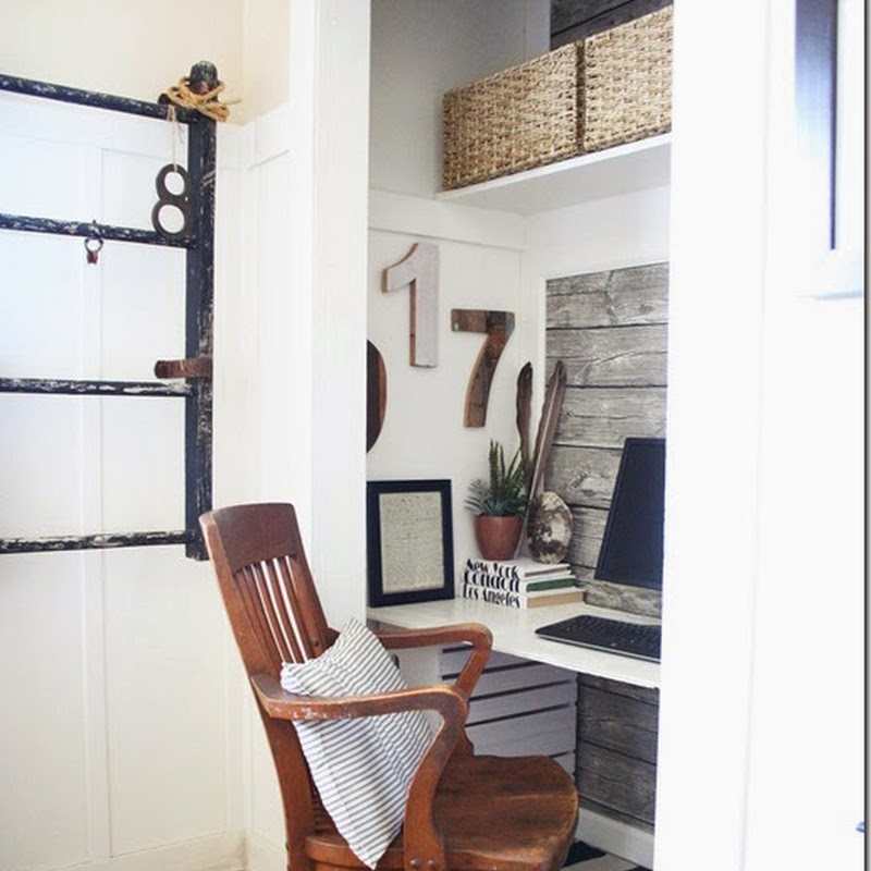
Most of The Grand Budapest Hotel is shot so you are looking straight at, straight down, or straight up at something. Everything is carefully centred in the middle of the frame - everything from people to buildings to pastries. The style of architecture is classic and symmetrical. It kind of does this symmetrical-loving girl's heart good to see everything lined up and organized like that. Symmetry gives the film a formality (although it is awkwardly formal at times because of the quirky characters and their antics). The rigid symmetry and centering also looks artificial and even a bit child-like which helps reinforce the appearance of this being another world. The symmetry also serves to make you aware of the composition which in turn serves to make you feel like you are looking at another world.
If you have read blogs for any length of time, you will be familiar with the same composition style. Centering the subject and tight symmetrical or semi-symmetrical composition are favourite tools that many bloggers use to take interesting and modern-looking photos of rooms, crafts, travel shots, people, or almost anything really.
 |
| Oh Happy Day |
 |
| SF Girl by Bay |
 |
| This Heart of Mine |
 |
| Bright Bazaar |
One of the other composition techniques Wes Anderson employs is the use of strong horizontal lines. I found this most evident in distance shots, like the one of Gustave and Zero running through the snow in the upper right in the collage below. Of course, horizontal lines happen naturally when you shoot your pictures at a 90 degree angle, but it is emphasized by having people or vehicles move straight across the scene and often at a distance so they appear almost as silhouettes.
 |
 |
| Design Mom |
 |
| Martha Stewart |
 |
| Design Mom |
 |
| The House that Lars Built |
 |
| Brooklyn Limestone |
RICH SATURATED COLOURS:
Wes Anderson is also known for the distinctive colour palettes that he creates for each of his films. In The Grand Budapest Hotel he used cheerful reds and pinks and purples in the hotel scenes. The exterior of the hotel was painted a range of intense pinks, the interior had red walls in the concierge and elevator, blush pink walls in the lobby, red patterned carpets throughout, and the staff wore royal purple uniforms. It is a strong and distinctive colour choice, but it also makes the movie.
I see lots of saturated colours on blogs, although not usually as intense as in The Grand Budapest Hotel. Saturated colours appear more in craft projects, flowers, food, and even fashion photographs, than in interior decorating. Most people decorate with more livable neutral colours, although there are a few bright and beautiful rooms out there in blogland.
 |
| Young House Love |
 |
| Real Simple |
 |
| Decor Sponge |
 |
| Bright Bazaar |
 |
| House and Home |
PLENTY OF PASTELS:
Many of the scenes in The Grand Budapest Hotel, especially ones that involve Agatha and the bake shop have lots of pink, yellow, and blue pastel colours.
Pastel colours are a favouite in blogland. Pastels are very livable so are used for pretty much everything from food to fashion to flowers to decor. The tone of pastels can vary though, from more serious greyed pastels to bright and happy pure-toned pastels.
 |
| Martha Stewart |
 |
| Martha Stewart via Home Depot |
 |
| Style at Home |
 |
| Real Simple |
 |
| West Elm |
THE MONOCHROMATIC LOOK:
All the outdoor shots were snowy and overcast creating a monochromatic muted feel to them. The shots even appeared to be black-and-white at times.
 |
 |
 |
| Design Mom |
 |
| Martha Stewart |
MOODY LIGHTING:
The lighting in The Grand Budapest Hotel ranges from bright and intense to dark and moody. I found the dark lighting especially interesting. The background in these shots was dark with the light focused on the character's faces giving them the look of an old master painting.
 |
| Woman Writing a Letter by Gerrit ter Borch (source) |
 |
| Portrait of a Man Holding Gloves, Rembrandt (source) |
 |
| Style at Home |
 |
| Real Simple |
 |
| Making it Lovely |
 |
| Martha Stewart |
Although many of the blogs I admire remind me of Wes Anderson's design style, I have to give a shout out to Will Taylor, the blogger behind Bright Bazaar, because his blog is the one that most distinctly fits this style. I love Will's photography and composition and when I read Bright Bazaar I get something of the same feel as The Grand Budapest Hotel.
If you want to get a taste of what I'm talking about, here's the trailer to The Grand Budapest Hotel. The movie is a feast for the eyes and especially if you are a blogger.
I would love to know what other bloggers think? Did you feel like you had fallen down the rabbit hole of the blog world too when you watched The Grand Budapest Hotel?


.jpg)


.jpg)


Your creative brain was working over time! I do that when I what the interiors and clothing on Downton Abbey. The Grand Budapest Hotel was a fun movie.
ReplyDeleteMentioned you and your diet on my blog today.