
Today is the first day of summer - yahoo! Bring on the warm weather, going to the cottage, the relaxed style of living, and fresh fun summer decorating. Style at Home magazine comes out with design trends each season and this summer's are truly inspiring - they range from Aegean blue to kilim textiles to country colours. Of the three, it is the last one - country colours - that particularly interests me.
Style at Home has partnered with Home Hardware (a Canadian hardware store) and Beauti-Tone paints to come up with a Country Colour paint collection. I was curious to hold the paint chips in my hands and see the inspiration pictures with my own two eyes so I went to Home Hardware and got myself a copy of the paint brochure. The photos are gorgeous and the paint colours amazing, but do you know what really caught my attention? It was the key words used in the brochure:

I had two particular favourites in this booklet and they couldn't be more different - one room is elegant with rich colours and the other white, light, and breezy.
I would love a graceful and stylish entrance hall like Mugwump,

and I'm convinced I would be a better artist if I had a studio like Whychwood.

The country colour collection on the Style at Home website had different inspiration pictures, although the palette was the same (you can find the three rooms below here, here, and here). What really struck me when I looked at these inspiration pictures is how the colours are taken from nature.
Doesn't the room below remind you of the colours of vast fields of golden wheat on the prairies.

And the room below resemble an overgrown English garden with soft gray clouds in the sky overhead.

And the different blues in the room below evoke the ocean with a sandy shore.

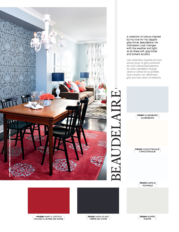
One of the reasons I was interested to see what colours the talented folk at Style at Home had selected for the Country Colour Collection was that I have just painted our bedroom in what I think of as a country colour. I used Benjamin Moore Silver Gray 2131-60 which is a soft gray-blue colour. I looked through the brochure and sure enough the colour Oldenburg (the top paint chip in the picture below) is very similar to the shade I used.

The rooms designed using country colours are just what the brochure says - they are fresh and natural, they are timeless, and the calm casually-elegant atmosphere is easy to live in. All the things that are a priority to me in my own home. Do country colours appeal to you?

Style at Home has partnered with Home Hardware (a Canadian hardware store) and Beauti-Tone paints to come up with a Country Colour paint collection. I was curious to hold the paint chips in my hands and see the inspiration pictures with my own two eyes so I went to Home Hardware and got myself a copy of the paint brochure. The photos are gorgeous and the paint colours amazing, but do you know what really caught my attention? It was the key words used in the brochure:
- fresh natural tones
- soothing simplicity
- timeless design
- casually elegant atmosphere
These are all things that I want in our home!


And the room below resemble an overgrown English garden with soft gray clouds in the sky overhead.

And the different blues in the room below evoke the ocean with a sandy shore.


Linked to Inspiration Friday at At the Picket Fence


.jpg)


.jpg)


Hi Grace! I love all these colors...I could totally live in every room you showed. I'm working on my entry right now. I keep wishing it was bigger but it's not so I'm trying to make it "look" bigger. Challenging. Hope you are enjoying your summer. Remember just a year ago you were getting ready for your trip? Seems like just yesterday.
ReplyDeleteWow, I want this issue!!! *le sigh* I will be back later to play some more on this post....
ReplyDeleteLOVE! where can i get my hands on this catalogue! Any decorating plans or project for this weekend Grace?
ReplyDeleteOh the second image really speaks to me!
ReplyDeleteI so appreciate your treasured friendship and lovely support.
Thanks for sharing. I am salivating right now.... not really.. but kind of. I love every room!
ReplyDeleteI love all those images....I am really into greys these days with hints of blue!
ReplyDeletenice work
ReplyDeletegood post
ReplyDelete